Making the Choice Between Portrait and Landscape Display Screens
There are pros and cons to both types of infotainment screen orientations.
 Ford
Ford
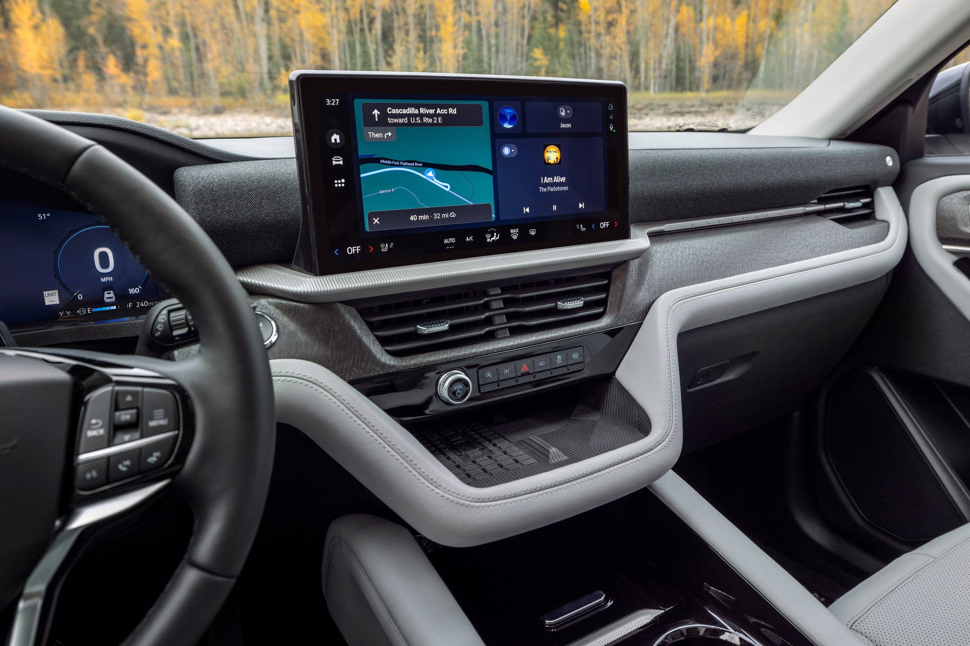
Whether to choose a vehicle with a portrait or landscape infotainment screen may be the automotive world's hot new choice, sort of like deciding between front-wheel or rear-wheel drive. Some automakers have picked a side, while others see merit in both. Each orientation has its pluses and minuses.
 Land Rover
As Screen Sizes Increase, It Gets Tougher to Fit a Wide Display
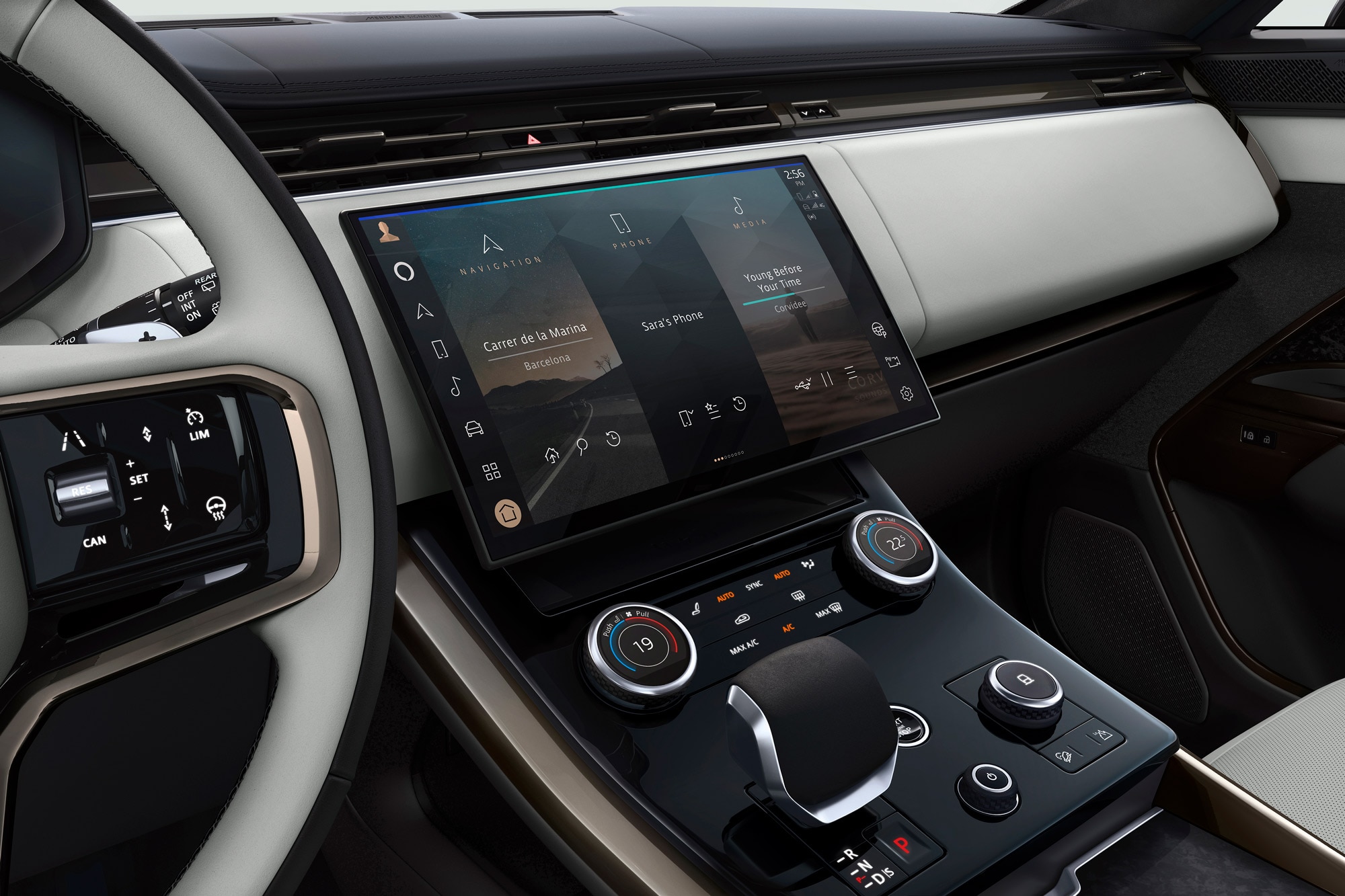
When an automaker wants to put a large landscape screen into a vehicle, it can set it either atop the dash or within the center stack. If choosing the center stack, it may be constrained by the amount of real estate available.
As screen sizes creep up into the double-digit measurements, they get tougher to wedge into narrow cars. Consider a 10.0-inch-diagonal, 16:9-aspect-ratio display. It has a long edge of 8.7 inches and a short edge of 4.9, meaning a landscape orientation would require nearly 9 inches of space between the driver and passenger. Turning that display 90 degrees, however, provides the same screen area in a narrower package. As with building in a densely populated city, sometimes the only way to go is up.
 Subaru
Unreachable Screen Area Is Not Useful
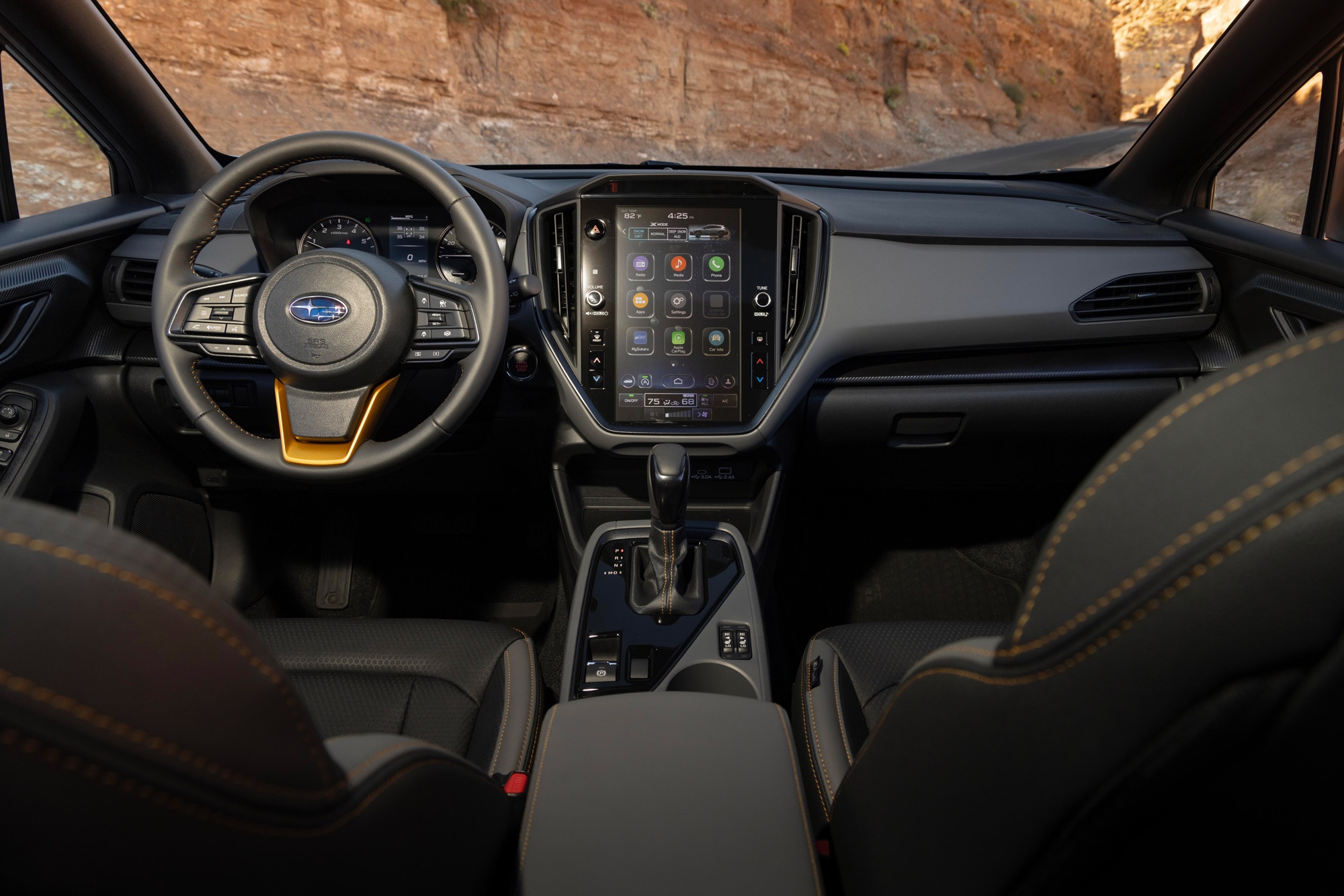
A touchscreen is only useful if you can touch all of it. This is another consideration wherein a portrait screen may have an edge.
Suppose you have the space to fit a wide landscape screen into the interior you're designing. You then have to take the driver's reach into account. Assuming the same 10.0-inch display size and assuming that display is centered in the vehicle regardless of orientation, a landscape setup would put the far edge of the display nearly 2 inches farther away from the driver than a portrait setup.
 Tesla
Tesla
Line of Sight Matters
Where your gaze goes when you're operating a touchscreen while driving has a big effect on safety. The farther down from the windshield your eyes have to wander, the longer the time they're off the road.
In this case, the landscape display has at least a theoretical advantage. Assuming the top of a 10.0-inch screen is positioned at the same height in each orientation, a larger portion of the landscape display sits within the driver's periphery, making it easier to take quick glances.
That said, what's in or close to your line of sight also depends on where interface designers place important information on the screen.
"The orientation of the screen is likely not nearly as important as the design itself and whether the menus and other functions require a lot of attention from the driver," said Joe Young, director of media relations at the Insurance Institute for Highway Safety (IIHS). "Time looking away from the roadway is associated with higher crash risk, so infotainment screens that require a lot of driver attention to operate basic functions have the potential to increase crash risk."
To combat this, automotive user-experience designers have started putting more info — including navigation directions and current audio — on instrument-panel screens and head-up displays in front of the driver. This doesn't fully eliminate the need to look and reach down to the bottom of a tall portrait display for some functions, particularly given that touchscreens require more attention to control than the hard buttons they replace. But automakers have a solution for that: voice commands.
 Volvo
Volvo
Automakers Experiment With Landscape, Portrait, and Other Screen Options
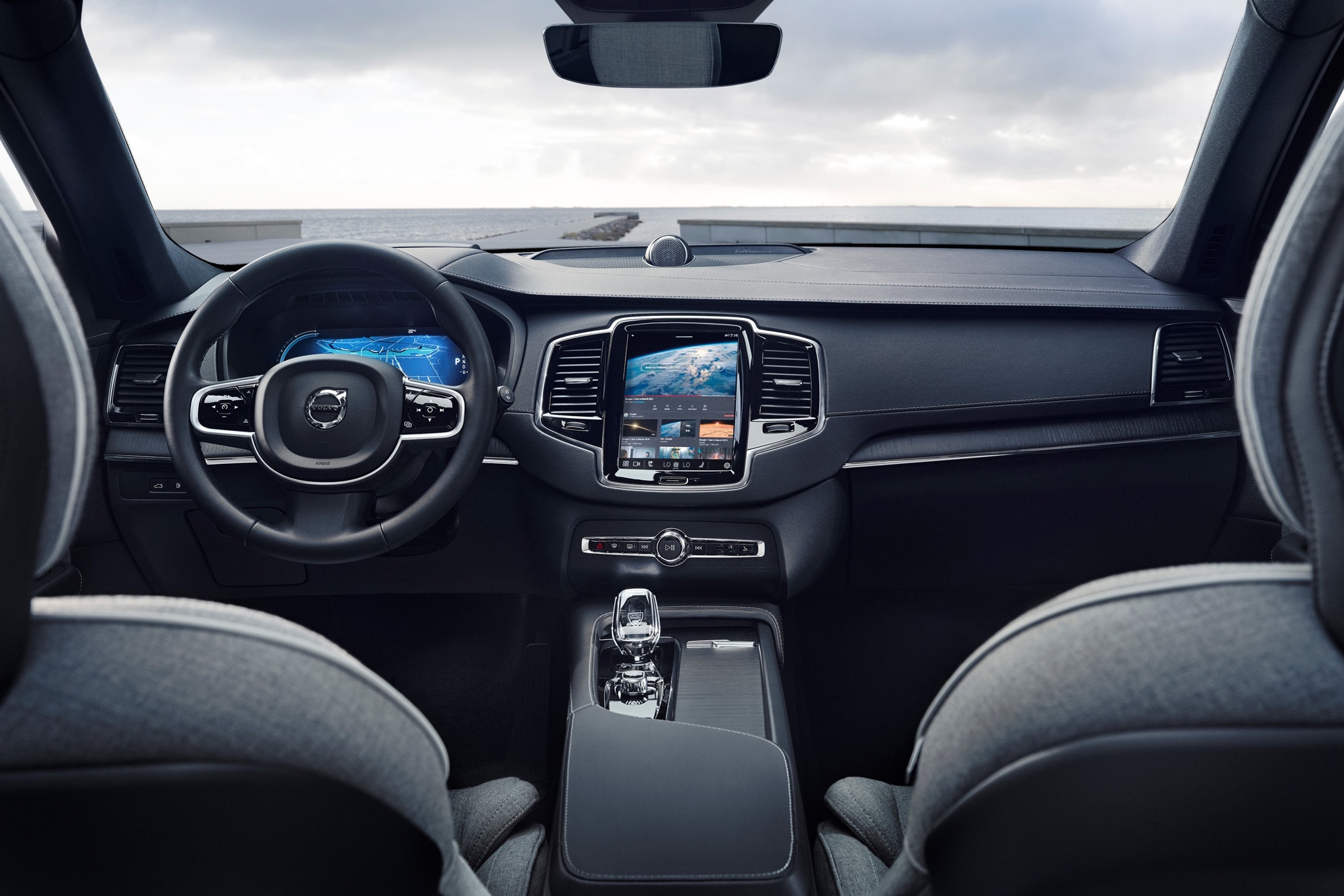
While landscape was the de facto industry standard for a long time, a few brands are switching things up. Volvo and its electric-vehicle-focused sister brand Polestar are firmly on Team Portrait, and Subaru is in the process of moving its vehicles — with the exception of the Toyota-collab BRZ sports car and Solterra EV — away from landscape displays.
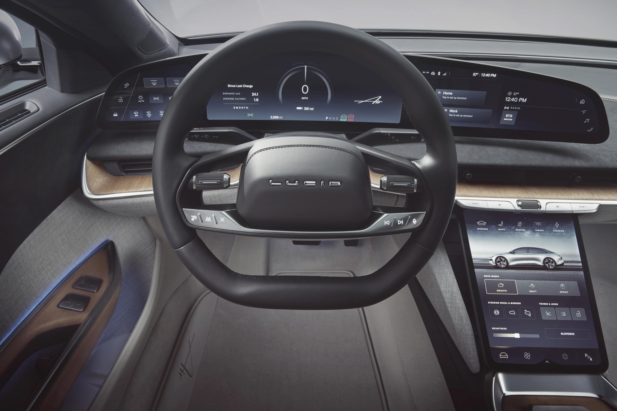
The Lucid Air actually has both. A landscape upper display called Pilot Panel covers navigation, audio, and phone functions, while a lower portrait screen handles climate control and vehicle settings.
 Lucid
Lucid
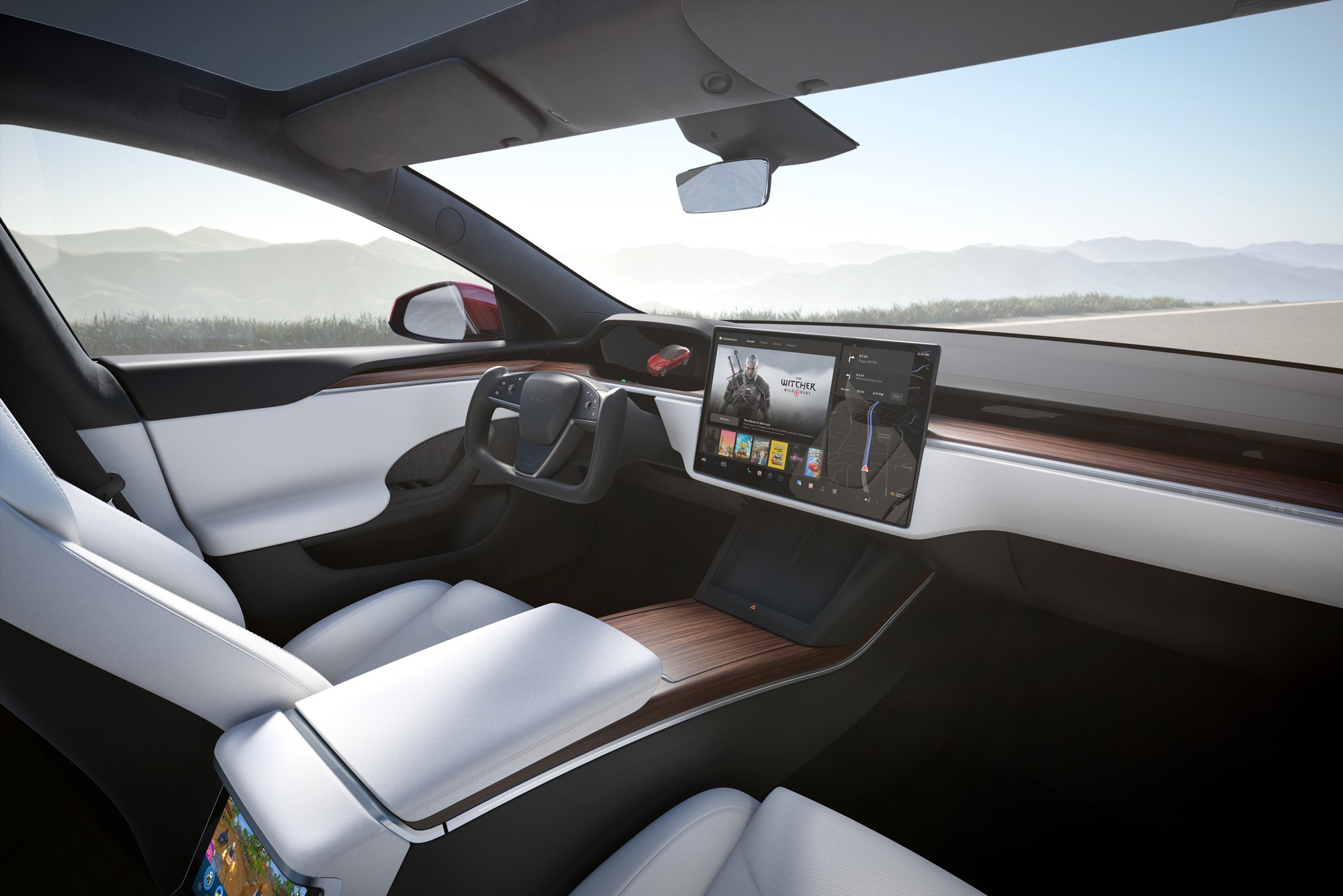
The Tesla Model S launched in 2012 with a 17.0-inch portrait screen, which it kept for more than a decade. But now the electric sedan boasts a 17.0-inch landscape display that can tilt left or right to favor the driver or front-seat passenger.
One likely reason for this design change is that Tesla now offers streaming services through its infotainment system, which owners can take advantage of while parked. Given the aspect ratios of most video content, a wide screen might make more sense than a tall one.
 Ford
Ford
Then there's Ford, which has yet to determine its best setup. Back in 2020, it introduced a new generation of the Explorer SUV with a standard 8.0-inch landscape display and an optional 10.1-inch portrait screen for upper trims. That option goes away this year, as all 2025 Explorers will use a 13.2-inch landscape unit.
That 10.1-inch screen lives on, though, in the redesigned-for-2024 Ford Ranger. It's the base setup here, while a 12.0-inch display — also in portrait orientation — graces the center stacks of the pricey trims.
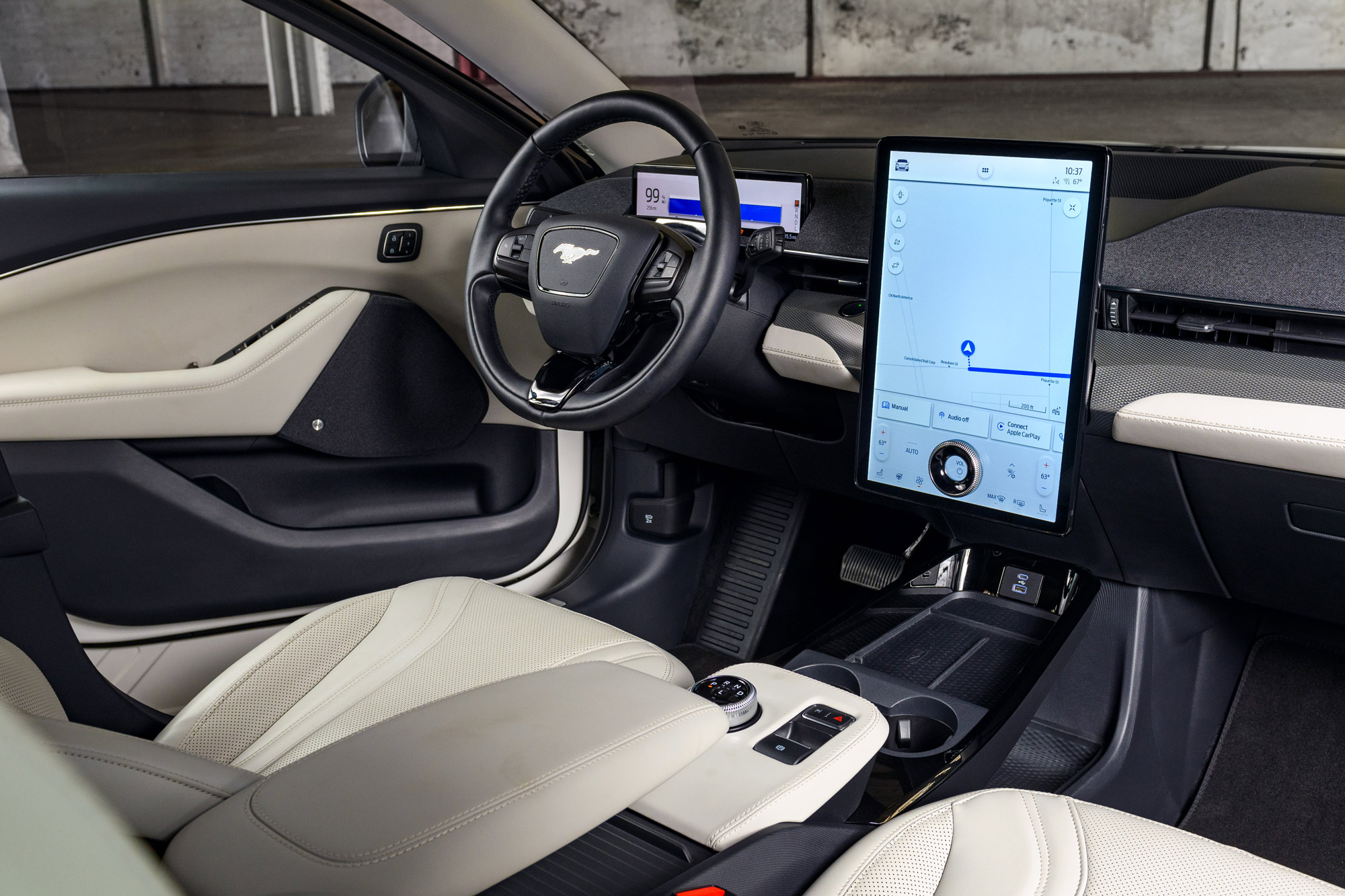
The Mustang Mach-E, which debuted for the 2021 model year, still has a 15.5-inch portrait screen, complete with an unusual multifunctional dial sticking out of the lower portion so users can quickly adjust the radio without glancing down. The system otherwise relegates lesser-used controls — such as climate and vehicle settings — to the bottom of the screen while presenting navigation and media info up top.
 Lincoln
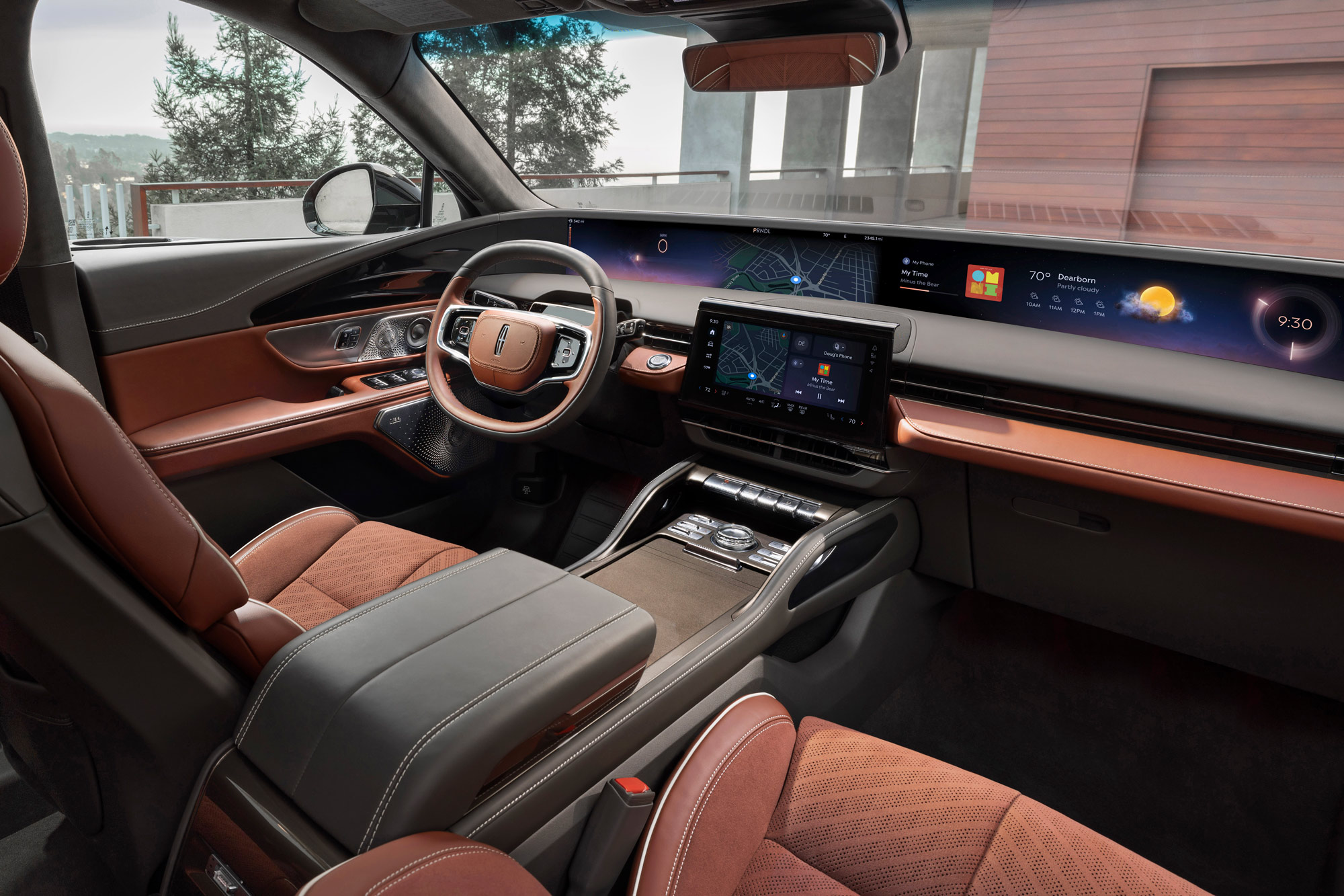
Over at Lincoln, Ford's luxury wing, the 2024 Nautilus recently brought to market a dash-spanning wraparound display, controlled by a landscape unit in the center console. Located directly under the windshield, this superwide display will put important information in the driver's periphery and possibly lessen the amount of time their eyes are away from the road.
Written by humans.
Edited by humans.
 David Gluckman
David Gluckman has over a decade of experience as a writer and editor for print and digital automotive publications. He can parallel park a school bus, has a spreadsheet listing every vehicle he’s ever tested, and once drove a Lincoln Town Car 63 mph in reverse. When David’s not searching for the perfect used car, you can find him sampling the latest gimmicky foodstuffs that America has to offer.
Related articles
View more related articles